2021iii22, Monday: font (mis)judgments.
Like many ex-hacks, I take fonts seriously. Clearly US judges don't - or rather, they do for the wrong reasons. More fool them.

Short thought: It may be just my background as a reporter, but fonts and layout matter to me. A well-chosen typeface, apt for the task at hand, and a design which leads the eye to where it needs to go and includes enough space for the text to breathe, aren’t afterthoughts. They’re integral to the process of respecting the reader’s attention, and maximising the chance that the words will get past the pupil and into the brain.
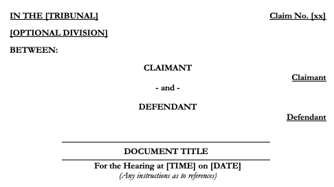
None of that changes when you’re an advocate instead of a journalist. The more so, perhaps: obviously a nice design isn’t going to save a hopeless case or slipshod drafting, but all things being equal a pleading or skeleton which makes the tribunal’s life easier can’t hurt, and is highly likely to help.
I’m staggered, therefore, when I discover friends and colleagues who don’t have templates that do the hard work for them, routing around Microsoft Word’s disastrously unpredictable list settings and ensuring that headings, subheadings, and cascading numbering all work consistently and well.
I started developing one about three months into pupillage, with styles for every type of paragraph and heading I needed. I update it every few months. It stands me in good stead. It does the critical job of making sure I only need to worry about the words.
The one thing I never settle on, though, is a font. Not for me Times New Roman; I know it’s traditional, but sweet Jesus it’s boring, ugly and not particularly pleasant to read. Calibri or Cambria? No. Helvetica? A little too grotesque. Arial? Don’t even. Seriously.
I waver between Liberation Serif (for when a serif font is absolutely necessary) and Gill Sans (my BBC background leaves me with a huge soft spot for this). Both are readable, clear, understated and - critically - reasonably compact.
(This is why, sadly, I have to avoid Optima. It’s always been a clear favourite of mine, hinting at serifs and exploiting their readability without actually quite displaying them. But it’s just too big, so even a relatively short skeleton starts looking like something of a novella to a time-pressed judge.)
Sometimes, though, I return to an early love: Garamond. Not only is it a thing of beauty, harking back to the early Apple days (when it was the standard house font for printed materials). It’s also startlingly compact. When you’re short of space and there’s a page limit, Garamond can squeeze in about 15% more words.
Unfortunately, everyone knows this. Including, apparently now, the DC Circuit Court of Appeals in the USA, which has now explicitly said it wants Century or TNR, and specifically doesn’t want Garamond.
Tasteless beggars. Shame on ‘em. Not least for the utter monstrosity of a font they used to issue the edict.
(This is not unduly to critique my friends who don’t see it that way - I’m looking at you, Daniel. But there’s been a nice little twitter-spat brewing - nicely good-natured despite the critically important nature of the subject matter - among UK barristers on this. It seems to have died down, so obviously one shouldn’t pitch in and re-ignite it. Obviously.)
Someone is right, and wonderfully generous, on the internet: Anyone involved in civil litigation needs to understand Denton.
For those fortunate enough to be uninitiated: more often than any sane person would like, things go wrong. Deadlines are missed. Orders or rules are broken. And sanctions are applied by the Court.
When they are, rule 3.9 of the Civil Procedure Rules allows a party to apply for relief from those sanctions – to have permission to file a late pleading, say, or to use an expert witness. But the rule is very brief. How the Courts will apply it in practice is the subject of an ever-expanding body of authority, arising primarily from the case of Denton v TH White [2014] EWCA Civ 906 which set a three-stage test: Was the breach serious or significant? Was there a good reason for it? What, in the light of all the circumstances, is the just thing to do?
Clearly, applying this is – as we lawyers say – an intensely fact-specific exercise. Every situation is different. But that body of authority can help you work out where your client stands – and maximise the odds of getting the result you want.
How, though, to keep track of it? In an act of wonderful generosity, Dr Rachel Segal of St John’s Chambers in Bristol not only does so, but regularly shares the results in a PDF, currently more than 200 pages long. If you’re seeking relief from sanctions, or opposing it, you can’t do better than to start with Rachel’s document, current as of last month.
I was reminded of Rachel’s magnum opus by an equally superb resource, which I must have mentioned before: Gordon Exall’s Civil Litigation Brief website. How the man finds the time to do any actual billed work is beyond me, but this site is an absolute godsend, particularly for examples of how the courts deal with knotty procedural issues.


